我们发现了什么
面向 AI 智能体的排版技能——审查并产出达到出版级别的文本。
- 来源:GitHub(发现于 2026-08-05)
- 证据等级:D · 发现产品或需求信号,暂未获得可核验的商业证据。
- 商业模式:待核验
- 主题:独立产品
- 初筛评分:18.4/100 · 收录 1 次
证据,比故事更重要。
规则清洗与初筛,未经人工商业核验。原文语境、实际客户和付费情况仍需自行验证。
引用与数字披露
来源类型(原作者自述/第三方测算/媒体转引)需采集端标注,本版尚未落字段。
- 作者
- 未标注
- 抓取日期
- 来源类型
- 未标注
- 币种
- 未标注
- 口径
- 未标注
- 披露主体
- 未标注
- 披露日期
- 未标注
中文辅助译文(全文)
practicaltypography
你的智能体(agent)已经了解排版规则。它不知道哪些规则重要、按什么顺序重要,或者什么时候可以打破它们。
一项审计并产出出版级排版的技能,适用于博客、网站、文档、幻灯片、简历、数据表格和 PDF —— 以 Matthew Butterick 的《实用排版》(Practical Typography)为依据,并与项目自定的启发式规则以及当前的可访问性、国际化、字体和交付要求相分离。其门控审计先对上下文分类,保护字面内容,检查最强可用证据,应用更高优先级的约束,然后报告最具影响力的修正项。
演示
同一个智能体。同一段提示词。其中一个先读取了技能。 提示词:"我的博客看起来不专业,但我找不到原因。你能审计一下排版吗?" —— 附带 CSS:14px Open Sans/Arial,line-height: 1.8,全宽栏,段落缩进 + 外边距,两端对齐,大写下划线标题,粗体斜体块引用。
<table> <tr> <th width="50%">任意智能体,原生</th> <th width="50%">同一智能体,<code>typography</code></th> </tr> <tr valign="top"> <td>
一份扎实的 8 点清单:14px 太小("使用 16–18px"),行宽不受限("可读字符数 45–75"),大写 + 下划线标题,两端对齐产生"河流",段落分隔冗余,粗体 + 斜体块引用,"16px 以上用 1.5–1.65 的行高读起来更好",直引号。
(都是真实问题。没有顺序,没有严重程度,对字体的判断缺失 —— Arial 就静静躺在字体栈里没人提及。数字都是凭感觉:45–75、1.5–1.65、"理想 1.125rem+"。)
</td> <td>
[MAJOR] 正文字号:14px 低于范围 → 18px(15–25px) [MAJOR] line-height:1.8 远高于 1.2–1.45 → 1.4 —— "如果你刻意想要 Medium 那种通透感,搭配应该是 19–21px 配 1.5–1.6,绝不是 14px 配 1.8" [MAJOR] 行宽(measure):未限制,桌面端 150+ 字符 → max-width: 65ch —— "最常见的网页排版错误" [MAJOR] 字体栈:Arial 属于禁用字体;按"未列入字体"标准判定 Open Sans 已过度曝光 → Source Serif / Charter / IBM Plex
……接着是段落、标题、强调、字符 —— 每项标注 [MAJOR|MINOR],最后给出修正后的 CSS 代码块,以及"造成最大破坏的三项修正"。
</td> </tr> </table>
原生答案并不差。它很好 —— 但它完全遗漏了字体,没有对任何问题排序,而且它的数字会随着模型上次读到的内容漂移。技能给出的答案是一套流程:按影响力顺序的六项检查、按定义而非感觉判定的严重程度、有来源的范围,以及一份用户可据此操作的强制结语。
前后对比
已提交的输入 demo/before.html 在 demo/AUDIT.md 中被审计,demo/after.html 在保留原文措辞的前提下应用了修改。字符组成的改动会显式报告。demo/RUN.md 记录了视觉检查的上下文与产物哈希;更广义的行为契约是 evals/scenarios.json 中的场景 EVAL-DEMO。
<table>
<tr>
<th width="50%">Before — 原生智能体</th>
<th width="50%">After — typography 技能</th>
</tr>
<tr valign="top">
<td>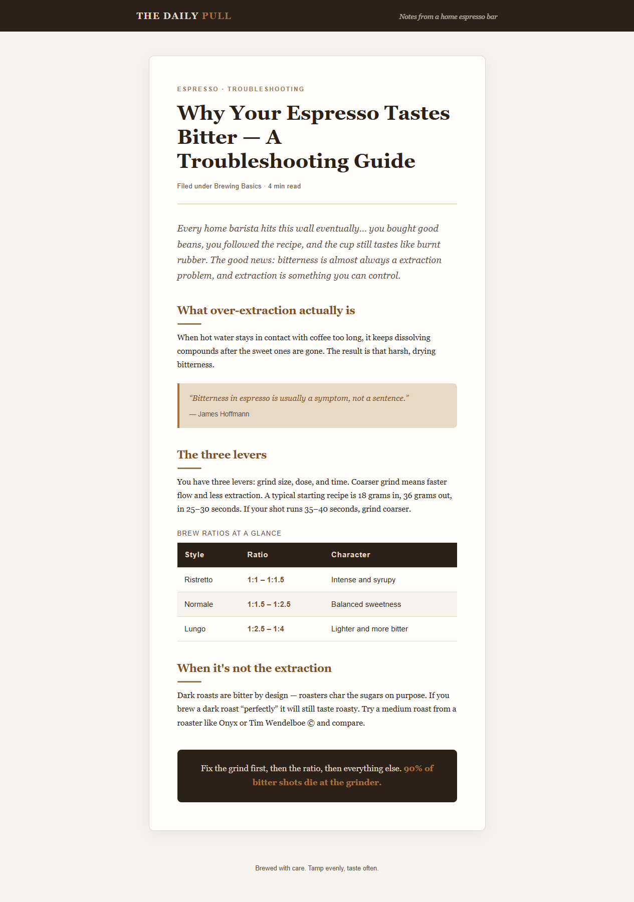 </td>
<td>
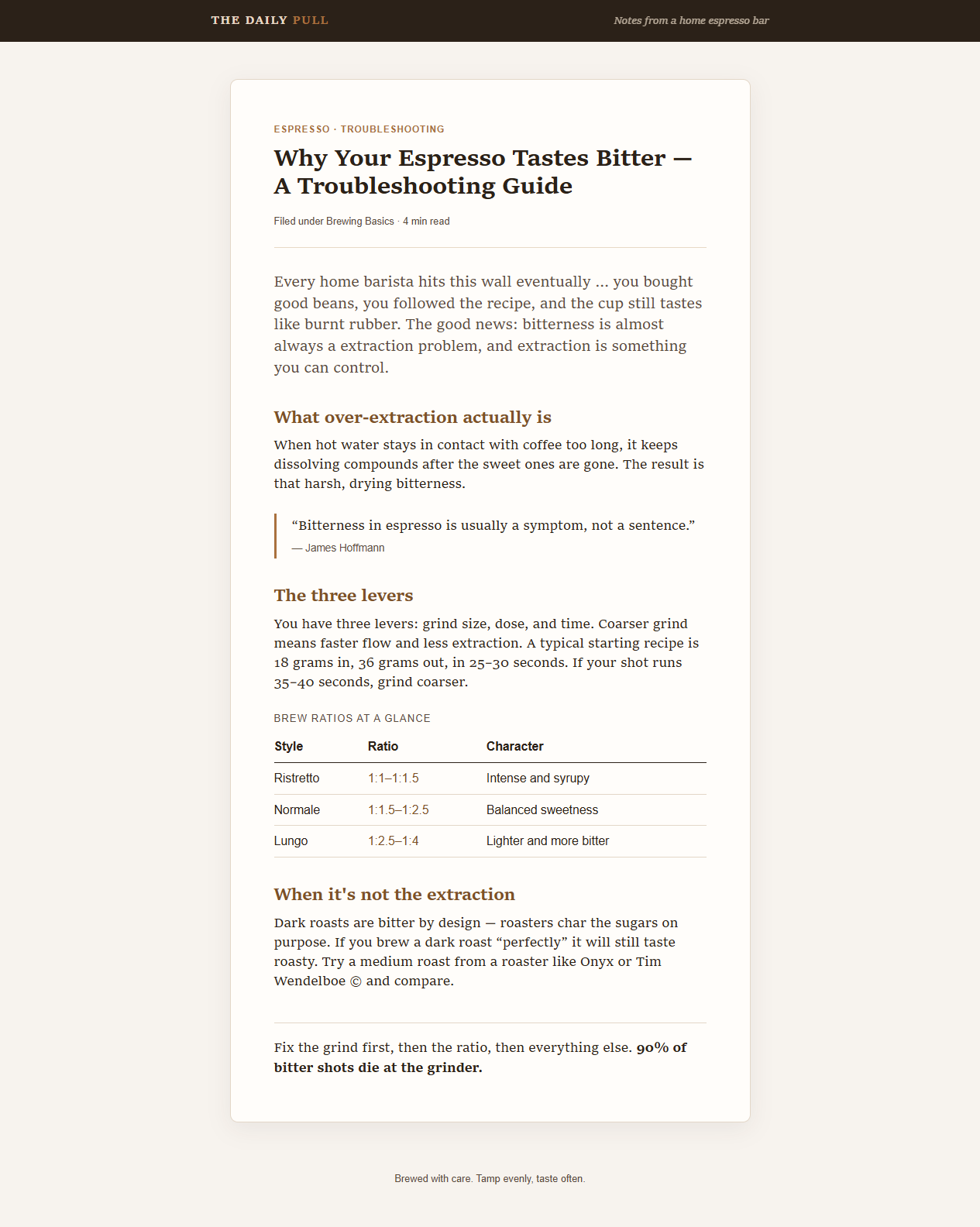 </td>
</tr>
</table>
最显著的变化:16px/1.7 的 Georgia 变为 18px/1.4 的 Charter,深色条纹表头变为配表格数字的细线分隔,斜体引言和淡色块引用收敛为结构上的区分,居中反色的结尾框变为左对齐文本。内容不变 —— 页面反而变短了(滚动高度从 1804px 减到 1584px),因为更紧的行高回收了网页默认 1.7 所浪费的空间。好的排版不增加字数成本。
安装
任意智能体(推荐):
Claude Code(插件):
Codex:让 $skill-installer 从 https://github.com/danium/practicaltypography 安装
手动:克隆并将 skills/typography 复制到智能体的 skills 目录。
内容构成
| 文件 | 覆盖范围 |
|---|---|
| SKILL.md | 紧凑路由、优先级顺序、门控审计、按影响力排序、证据等级、报告契约,以及可选的项目预设 |
| composition.md | 安全变换、字面内容保护、标点、空格、符号、数字、重音、强调与大写 |
| layout.md | 正文、段落、标题、自动列表、语义样式、块引用、表格、页面流、栏与网格 |
| fonts.md | 带日期的来源短名单,加上下文敏感的字符校验:字形、真实字重、特性、回退、应用支持与授权 |
| web.md | 声明与渲染证据、响应式行宽、WCAG 韧性、实际字体加载、回退指标、可变轴与光学尺寸 |
| media.md | 打印、幻灯片、邮件与协作、简历、数字表格、直接产出 PDF,以及最终交付检查 |
| international.md | 英语-拉丁字母范围、语言与方向元数据、对脚本敏感的中止条件,以及多脚本混合验证 |
| provenance.md | 稳定的规则 ID 分类为 PT、DEVIATION 或 CURRENT,附来源、范围、新鲜度与评估映射 |
| evals/ | 十四个版本化风险场景、最小化测试样本、可观察的评分标准、基线/候选结果,以及来源漂移审查 |
选择你的切入点
| 场景 | 技能如何处理 | |
|---|---|---|
| "这个页面/幻灯看起来不专业" | 门控审计、发现项按 [MAJOR\ | MINOR] 排序、修正值、证据等级与三大首要修复 |
| "为我的博客/文档站设置排版" | 正文基准,加上有针对性的组成、布局、字体与网页参考 | |
| "让它像 Medium 那样通透,不要像书那样" | 偏好协议:意图优先、参考优于引用数字、命名预设(Bookish · Airy modern web · Compact docs) | |
| "为我的会议幻灯片设计样式" | 视距校准、稳定的角色字号、对比度检查,以及编辑而非自动缩小 | |
| "我应该用哪种字体?" | 带日期的来源短名单,附字形、字重、特性、回退、支持与授权校验 | |
| "我的数据表格看起来不对" | 数字特性、按数字 种类 对齐、精度保留与媒介校准 | |
| "这个 PDF 能发吗?" | 直接导出、可搜索文本、字体嵌入与权利、元数据,以及末页检查 | |
| "审计这段阿拉伯语/日语/多脚本混合文本" | 语言元数据、保留闸门、权威路由,以及已渲染脚本检查 |
构建方式
仓库现在携带一套供应商中立的回归套件。十四个场景覆盖网页散文、响应式行宽、代码、邮件、打印、幻灯片、表格、PDF 交付、字体回退、WCAG 文本间距、非拉丁字母及多脚本混合文本、字体授权与字形覆盖,以及公开证据。基线结果通过静态指令检查记录了修订版 41559fe7ee3c27c4fc46a6feda29ad7898c7b4c6 哪里出了错;候选结果与确定性检查记录在 evals/ 中。这些记录并不伪装成模型输出。
这是什么(不是什么)
来源:Matthew Butterick,《Practical Typography》(2010 年至今)提供有来源支撑的排版基准。可访问性、国际化、平台行为、语义安全与授权要求来自当前的外部权威机构或项目安全决策。provenance.md 对每个规则簇进行分类,并记录其范围、来源或依据、验证日期与评估覆盖。本仓库是一份独立改写的提炼,并非该书本身,也未获得 Butterick 的认可或背书。
《Practical Typography》 由读者支持。如果这个技能物有所值,请购买该书或购买他的字体 —— 它们正是该技能一直推荐的专业级升级。
在技能明知与原书存在偏离的地方,它会明确说明。可选的预设被标注为项目自定的起点。当前需求不会被误归到 Butterick 名下,而源自来源的列表则被描述为带日期的短名单,而非完整复刻。
贡献
每条规则在发布前都必须分类为 PT、DEVIATION 或 CURRENT,并附来源与回归覆盖。请参阅 CONTRIBUTING.md。
许可协议
MIT —— 覆盖本提炼及其结构。底层的书籍及其内容仍归 © Matthew Butterick 所有。
译文由上游机器翻译生成,可能有误;判断请以英文原文为准。
英文原文(来源本站未改写)
practicaltypography
Your agent already knows typography rules. It doesn't know which ones matter, in what order, or when you're allowed to break them.
One skill that audits and produces publication-grade typography for blogs, websites, docs, slides, résumés, data tables, and PDFs — grounded in Matthew Butterick's Practical Typography and separated from project-authored heuristics and current accessibility, internationalization, font, and delivery requirements. Its gated audit classifies context, protects literal content, inspects the strongest available evidence, applies higher-priority constraints, then reports the most consequential corrections.
The demo
Same agent. Same prompt. One of them read the skill first. Prompt: "My blog looks unprofessional and I can't figure out why. Can you audit the typography?" — with CSS: 14px Open Sans/Arial, line-height: 1.8, full-width column, indent + margin on paragraphs, justified, uppercase underlined headings, bold-italic blockquotes.
<table> <tr> <th width="50%">Any agent, vanilla</th> <th width="50%">Same agent, <code>typography</code></th> </tr> <tr valign="top"> <td>
A solid 8-point list: 14px too small ("use 16–18px"), unconstrained line length ("readable 45–75 characters"), uppercase + underlined headings, justify rivers, redundant paragraph separation, bold+italic blockquotes, "line-height 1.5–1.65 at 16px+ reads better", straight quotes.
(All real issues. No order, no severity, no verdict on the fonts — Arial sat in that stack unremarked. The numbers are vibes: 45–75, 1.5–1.65, "ideally 1.125rem+".)
</td> <td>
[MAJOR] body font-size: 14px below range → 18px (15–25px) [MAJOR] line-height: 1.8 far above 1.2–1.45 → 1.4 — "if you deliberately want an airy Medium-style feel, the pairing is 19–21px with 1.5–1.6, never 14px with 1.8" [MAJOR] measure: uncapped, 150+ chars on desktop → max-width: 65ch — "the single most common web typography failure" [MAJOR] font stack: Arial is an avoid-list font; Open Sans judged overexposed by the unlisted-font criteria → Source Serif / Charter / IBM Plex
…then paragraphs, headings, emphasis, characters — each [MAJOR|MINOR], closing with a corrected CSS block and "the three fixes doing the most damage."
</td> </tr> </table>
The vanilla answer isn't bad. It's good — and it missed the font entirely, ranked nothing, and its numbers drift with whatever the model last read. The skill's answer is a procedure: six checks in impact order, severity by definition rather than vibes, sourced ranges, and a required closing the user can act on.
Before / after
The committed input demo/before.html is audited in demo/AUDIT.md, and demo/after.html applies the changes with the wording preserved. Character-composition edits are reported explicitly. demo/RUN.md records the visual inspection context and artifact hashes; the broader behavior contract is scenario EVAL-DEMO in evals/scenarios.json.
<table>
<tr>
<th width="50%">Before — vanilla agent</th>
<th width="50%">After — typography skill</th>
</tr>
<tr valign="top">
<td></td>
<td></td>
</tr>
</table>
The headline changes: 16px/1.7 Georgia became 18px/1.4 Charter, the dark striped table header became thin rules with tabular figures, the italic intro and tinted blockquote calmed down to structural distinction, and the centered inverse closing box became left-aligned text. Same content — and the page got shorter (1584px vs 1804px of scroll), because tighter leading recovers what the web-default 1.7 wastes. Good typography costs nothing in word count.
Install
Any agent (recommended):
Claude Code (plugin):
Codex: ask $skill-installer to install from https://github.com/danium/practicaltypography
Manual: clone and copy skills/typography into your agent's skills directory.
What's inside
| File | Covers |
|---|---|
| SKILL.md | Compact router, precedence order, gated audit, impact ordering, evidence levels, reporting contract, and optional project presets |
| composition.md | Safe transformations, literal-content protection, punctuation, whitespace, symbols, figures, accents, emphasis, and caps |
| layout.md | Body text, paragraphs, headings, automated lists, semantic styles, block quotations, tables, page flow, columns, and grids |
| fonts.md | A dated source shortlist plus context-sensitive validation for glyphs, genuine styles, features, fallbacks, application support, and licensing |
| web.md | Declared-versus-rendered evidence, responsive measure, WCAG resilience, actual font loading, fallback metrics, variable axes, and optical sizing |
| media.md | Print, slides, email and collaboration, résumés, numeric tables, direct PDF production, and final-delivery checks |
| international.md | English-Latin scope, language and direction metadata, script-sensitive stop conditions, and mixed-script verification |
| provenance.md | Stable rule IDs classified as PT, DEVIATION, or CURRENT, with sources, scope, freshness, and evaluation mappings |
| evals/ | Fourteen versioned risk scenarios, minimal fixtures, observable rubric, baseline/candidate results, and source-drift review |
| Pick your entry point |
| Situation | Where the skill takes it | |
|---|---|---|
| "This page/deck looks unprofessional" | Gated audit, findings ranked [MAJOR\ | MINOR], corrected values, evidence level, and top-three fixes |
| "Set up typography for my blog / docs site" | Body benchmark plus focused composition, layout, font, and web references | |
| "Make it airy like Medium, not like a book" | Preference protocol: intent governs, reference beats quoted number, named presets (Bookish · Airy modern web · Compact docs) | |
| "Style my conference slides" | Viewing-distance calibration, stable role sizes, contrast checks, and editing instead of auto-shrink | |
| "Which font should I use?" | Dated source shortlist plus glyph, style, feature, fallback, support, and license validation | |
| "My data tables look off" | Numeric features, alignment by number kind, precision preservation, and medium calibration | |
| "Can I ship this PDF?" | Direct export, searchable text, font embedding and rights, metadata, and final-page inspection | |
| "Audit this Arabic/Japanese/mixed-script text" | Language metadata, preservation gates, authoritative routing, and rendered script checks |
How it was built
The repository now carries a vendor-neutral regression suite. Fourteen scenarios cover web prose, responsive measure, code, email, print, slides, tables, PDF delivery, font fallback, WCAG text spacing, non-Latin and mixed-script text, font licensing and glyph coverage, and public evidence. The baseline result records what revision 41559fe7ee3c27c4fc46a6feda29ad7898c7b4c6 got wrong by static instruction inspection; candidate results and deterministic checks are documented in evals/. The records do not pretend to be model transcripts. What this is (and isn't)
Provenance: Matthew Butterick, Practical Typography (2010–present), supplies the source-backed typography benchmark. Accessibility, internationalization, platform behavior, semantic safety, and licensing requirements come from current external authorities or project safety decisions. provenance.md classifies every rule cluster and records its scope, source or rationale, verification date, and evaluation coverage. This repo is an independent paraphrased distillation, not the book, and is not affiliated with or endorsed by Butterick.
Practical Typography is reader-supported. If this skill earns its keep, pay for the book or buy his fonts — they're the professional upgrade the skill keeps recommending.
Where the skill knowingly deviates, it says so. The optional presets are labeled project-authored starting points. Current requirements are not misattributed to Butterick, and source-derived lists are described as dated shortlists rather than complete reproductions. Contributing
Every rule must be classified as PT, DEVIATION, or CURRENT, with provenance and regression coverage before it ships. See CONTRIBUTING.md. License
MIT — covers this distillation and its structure. The underlying book and its content remain © Matthew Butterick.
这条还缺什么证据?
下面每条都由本条已有字段推出(等级、理由、商业模式、来源次数、是否演示), 本站不生成推测性结论;通用验证方法放在方法论页。
- 可核验的收入或付费证据查官网定价页与付费口径;第三方数据源(如 GetLatka)只作旁证,需标注来源与时点。
- 商业模式未定确认按席位/按用量/授权还是开源托管版收费;开源项目另查 LICENSE 与是否存在付费版。
- 只有单一来源找一手站点或其他渠道是否重复出现同一产品;社区热帖数量不等于商业进展。
通用验证清单(谁有这个问题/谁愿意付费/一个人能交付哪一小步)见我们的筛选方法。